With the recent launch of our new online portal, we thought it would be a fun exercise to take a look at the previous incarnations of the Adept website.
Courtesy of the Internet Archive’s Wayback Machine (http://archive.org/web), we’ve pulled out a few snapshots of the website over the last 15 years, and passed them around for some laughs and comments.
Here’s a look backwards through the sands of time, from the current look and feel all the way back to the year 2000. Millennium bug, anyone?
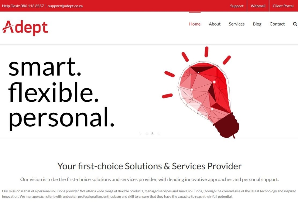
October 2015 – new website
The website’s current form. Sleek. Modern. Fully optimised for mobile browsing. A firm favourite with staff and hopefully all of the online community. It was a long road to get to this iteration, but the consensus is it was worth it! What do you think?
October 2013
The Adept website as it was until most recently. The old logo and colour scheme served us well for a good long time; for many long-term staff members it was the only general design they were familiar with.
It was a struggle to keep going with the design, though. Our shift to cover the Manages Services arena left the previous site lacking in many elements, not the least of which was modernisation and fluidity. This was one of the main reasons for the decision to perform a full rebranding and not just a site redesign.
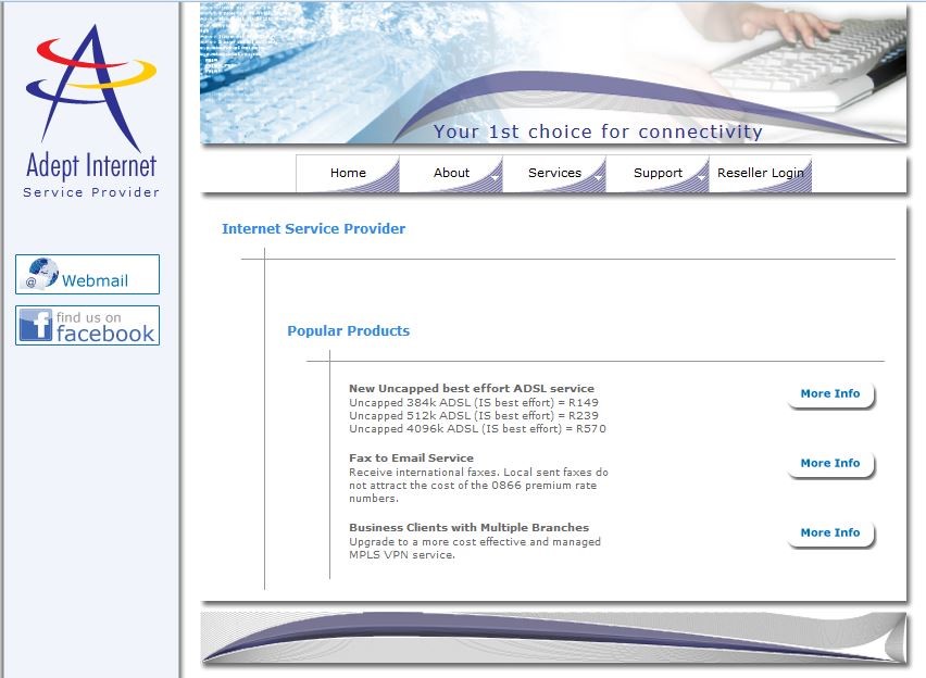
October 2011
At this intermediate stage, the site was more about providing core information than maintaining engagement, as evidenced by the absence of a social media presence and the Homepage display of products. Access to the Webmail portal was also openly displayed. Practical, or a visual distraction? It’s hard to say, since standards have changed so many times even since only then.
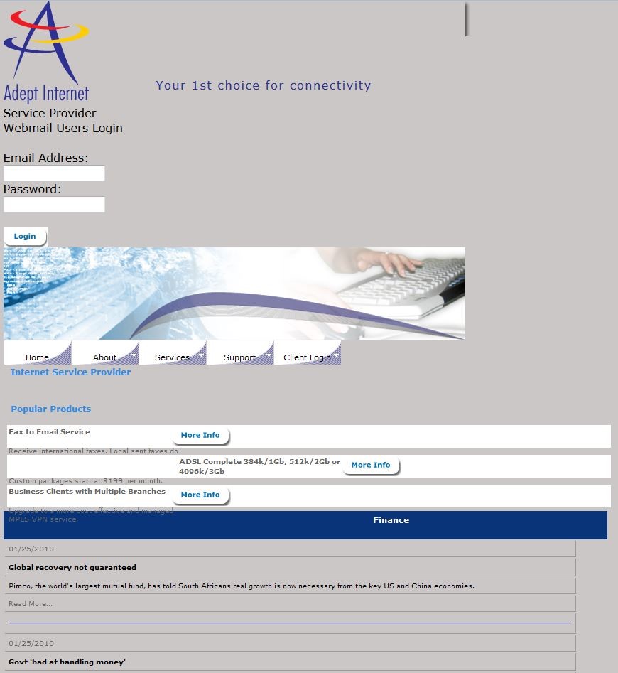
January 2010
We’re not sure the snapshot functioned correctly at that time, though one can see the prior newsfeeds we used to have. Ultimately people would migrate to dedicated portals for news updates, and make use of more modern technology, rendering a news feed superfluous on the site of a niche or industry-specific site.
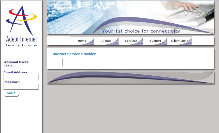
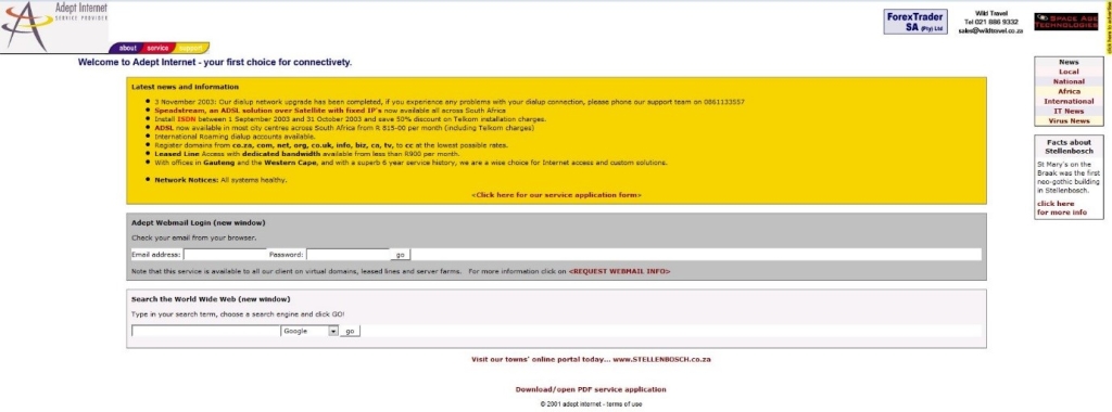
December 2003
Huge leap backwards in time! Only the modern-era Adept logo is recognisable near the top left. And yes, the by-line has a typo in it – “connectivety”
Cue the news links, area advertorials and service provider plugs. ADSL was the current big thing. And wow, you were asked to choose from various search engines – Google was just a noun, instead of also a verb!
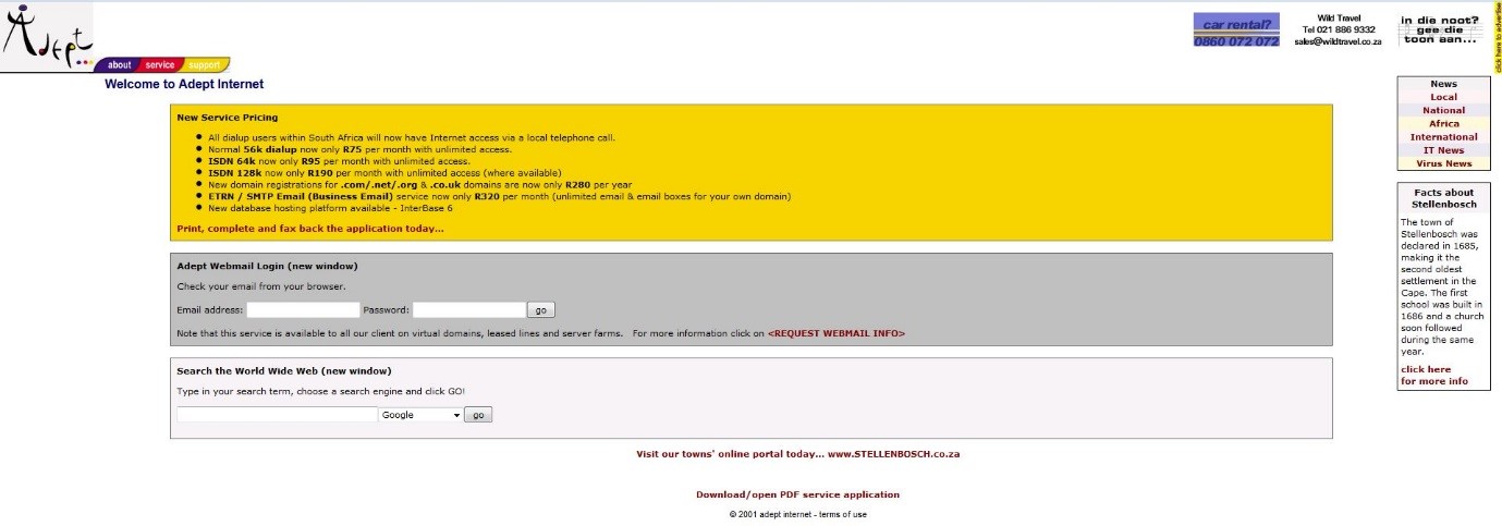
March 2002
Something looks odd…why, it’s the ancient Adept swirly logo! Also note the absence of a by-line. Simple site for simpler times.
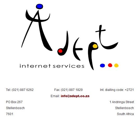
March 2000
Few at Adept can even remember the origins of the original swirly design; in fact, we’d have to quiz our founding Directorate about that. It was purely about Internet and connectivity services back then…what a long way we’ve come. And it’s been one amazing ride all the way!
The author wishes to thank the Internet Archive (www.archive.org) for making available the snapshots of the Adept website over the years. Their work is an amazing collection of Internet-sourced digital history collections.

